X – country birth | Y – country death | RADIUS – lifetime

Mongol Empire
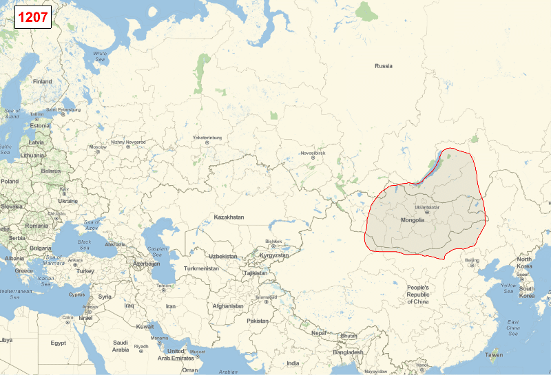
The Mongol Empire existed during the 13th and 14th centuries and was the largest contiguous land empire in history. Originating in the steppes of Central Asia, the Mongol Empire eventually stretched from Eastern Europe to the Sea of Japan, extending northwards into Siberia, eastwards and southwards into the Indian subcontinent, Indochina, and the Iranian plateau, and westwards as far as the Levant and Arabia. As you probably guessed the information is from here:
WikipediaData["Mongol Empire"]
And the image you see above is built with information stored in
EntityProperties["HistoricalCountry"]

Let’s see what we can do with these data. First of I will get the data, – and you can see we have 1990 countries listed:
    hc = EntityList["HistoricalCountry"];
    hc // Length
    (*1990*)
First of all I am curious about chronology of these social structures. The data go back in time so far that sometimes we simply do not have some information. Hence I will apply some filters to drop the missing information:
    startend = DeleteMissing[EntityValue[hc, {"Entity",
        EntityProperty["HistoricalCountry", "StartDate"],
        EntityProperty["HistoricalCountry", "EndDate"]}], 1, 2];
    startend = DeleteCases[startend, {_, _, _Alternatives}];
Now I sort by duration of country existence and look at a few countries with longest-existence:
    sorthc = SortBy[{#1, #3 - #2} & @@@ startend, Last];

    Row[TableForm[{#1, #2, N[UnitConvert[#2, "Year"]]} & @@@
    Reverse[#]] & /@{sorthc[[-10 ;;]], sorthc[[-20 ;; -11]]}, Spacer[50]]
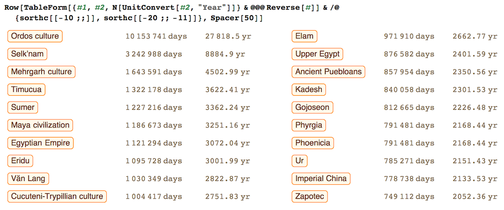
So the longest existing historical country according to our data is Ordos Culture counting about 28,000 years.
StringTake[WikipediaData["Ordos culture"], 505]
The Ordos culture was a culture occupying a region centered on the Ordos Loop (modern Inner Mongolia, China) during the Bronze and early Iron Age from the 6th to 2nd centuries BCE. The Ordos culture is known for significant finds of Scythian art and is thought to represent the easternmost extension of Indo-European Eurasian nomads, such as the Scythians. Under the Qin and Han dynasties, from the 6th to 2nd centuries BCE, the area came under at least nominal control of contemporaneous Chinese states.
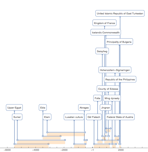
Now I am curios of how the countries’ lifetime was distributed throughout the whole history. Wolfram Language has a neat visualization tool – TimelinePlot – for that. We have so many countries that I will take a random sample of them to not overload the visual.
    SeedRandom[3];
    tmp=RandomSample[startend,20];
    TimelinePlot[Association@@Thread[EntityValue[tmp[[All,1]],"Name"]->
    (Interval/@tmp[[All,2;;3]])],Filling->Below,
    FillingStyle->Directive[Opacity[.2],Orange],PerformanceGoal->"Speed"]
And now with a larger sample of 1000 countries but without labels:
    SeedRandom[5];
    tmp=RandomSample[startend[[All,2;;3]],1000];
    TimelinePlot[Interval/@tmp,Filling->Below,
    PerformanceGoal->"Speed",AspectRatio->1,PlotTheme->"Marketing"]
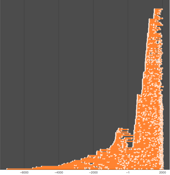
We see that the deeper in the past, the longer is lifetime and the fewer countries we have. This tendency can be easily visualized by plotting:
    BubbleChart[{#1,#2,#2-#1}&@@@Map[AbsoluteTime,startend[[;;500,2;;3]],{2}],
    ChartStyle->EdgeForm[Opacity[.05]],FrameTicks->None,ColorFunction->Function[{x,y,r},
    RGBColor[r,1-r,1-r,r]],PerformanceGoal->"Speed",ImageSize->1000]
X – country birth | Y – country death | RADIUS – lifetime
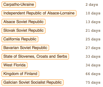
Obviously above-diagonal nature is due to the fact that enddate is always later than the start date. Amazingly there are many countries that exist just a few days. Let’s see the shortest living countries:
fewDAYs = Cases[sorthc[[All, 2]], x_ /; x > Quantity[0, "Days"]][[;; 10]]

TableForm@Flatten[Cases[sorthc, {_, #}] & /@ fewDAYs, 1]
I sort countries by their lifetime in years and plot RANK vs LIFETIME in a log-log plot:
    yearLIFETIME=QuantityMagnitude@N[UnitConvert[Cases[sorthc[[All,2]],x_/;x>Quantity[0, "Days"]],"Year"]];
    ListLogLogPlot[yearLIFETIME,PlotRange->All,PlotTheme->"Business",Filling->Bottom,
    FrameLabel->{"RANK","LIFETIME"},PlotLabel->"Log-Log plot in YEARs",BaseStyle->15,ImageSize->1000]
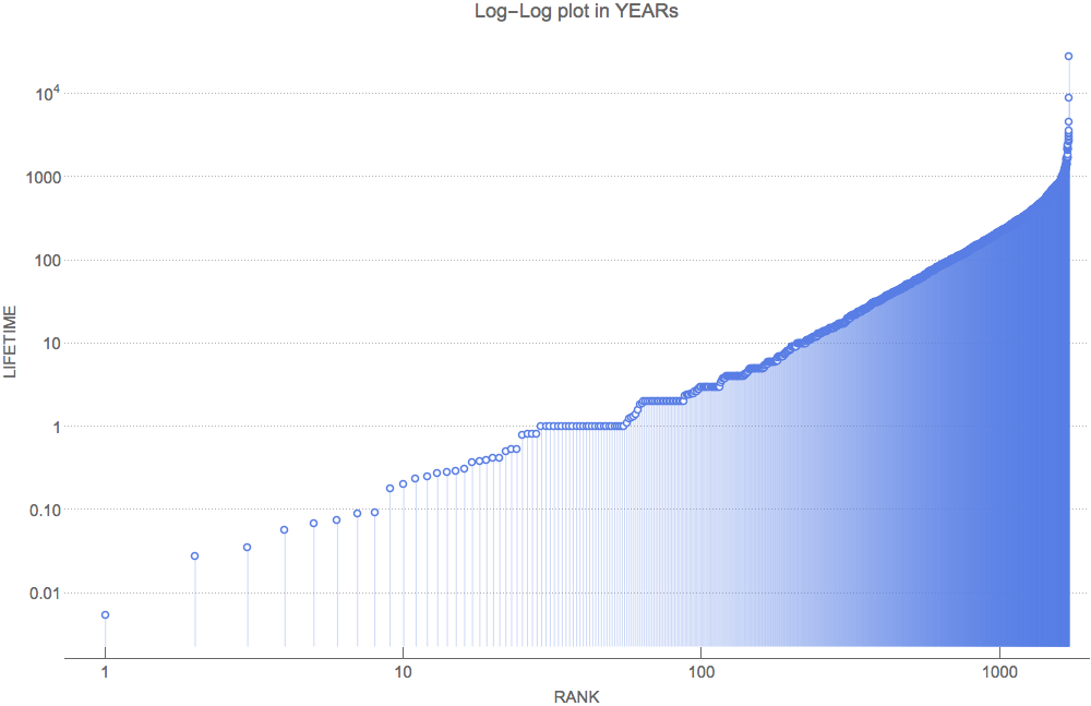
For small-lifetime countries we see almost a straight line – the sign of a power law. Now I would like to take a look at some specific counties. Especially those who grew spatially very fast, – of course, due to their military conquest.
Mongol Empire
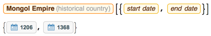
Let’s get all polygons related to historical borders of Mongol Empire for every year between its existence 1206 -1368:
    mongPOLY=ParallelTable[EntityValue[Entity["HistoricalCountry","MongolEmpire"],
    EntityProperty["HistoricalCountry","Polygon",{"Date"->DateObject[{t}]}]],{t,1206,1368}];
For many years we have many identical borders – let’s compress – find only unique borders:
    mongPOLY//Length
    mongPOLYcomp=DeleteMissing[DeleteDuplicates[
        Transpose[{Range[1206,1368],mongPOLY}],Last[#1]==Last[#2]&],1,2];
    mongPOLYcomp//Length
13 compressed out of total 163 total borders! I plot them all:
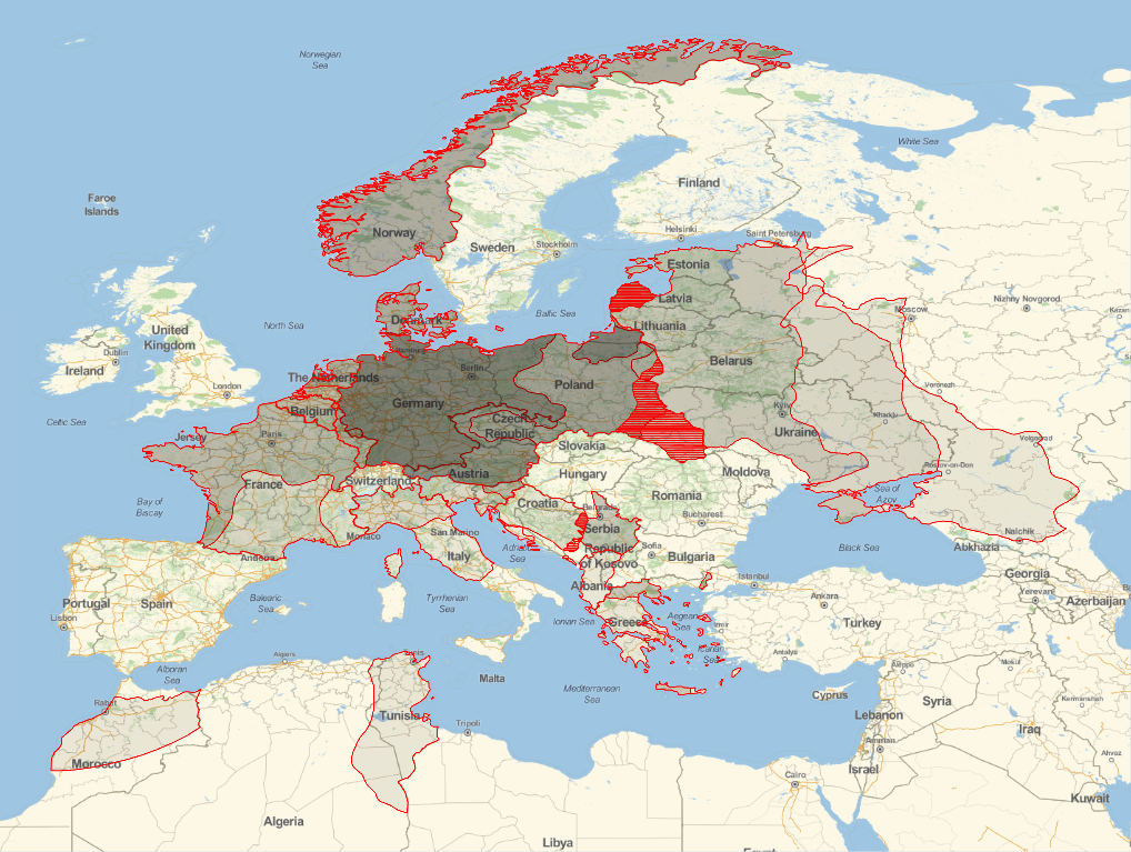
    GeoGraphics[{EdgeForm[Red], GeoStyling[Opacity[.07]], #} & /@
      mongPOLYcomp[[All, 2]], GeoProjection -> "Mercator",
     ImageSize -> 800, GeoBackground -> GeoStyling["StreetMap"],
     GeoRange -> {{20, 70}, {17, 133}}, GeoZoomLevel -> 4]

And for animation show at the top of the post:
    frames=ParallelTable[
    GeoGraphics[{EdgeForm[Red],GeoStyling[Opacity[.07]],mongPOLYcomp[[;;t,2]]},
    GeoProjection->"Mercator",ImageSize->800,GeoRange->{{20,70},{17,133}},
    GeoBackground->GeoStyling["StreetMap"],
    Epilog->Text[Framed[Style[mongPOLYcomp[[t,1]],20,Red,Bold],Background->White],
    Scaled[{.06,.955}]]],{t,1,13}];

    Export["MongolEmpire.gif", frames, "DisplayDurations" -> {.5}]
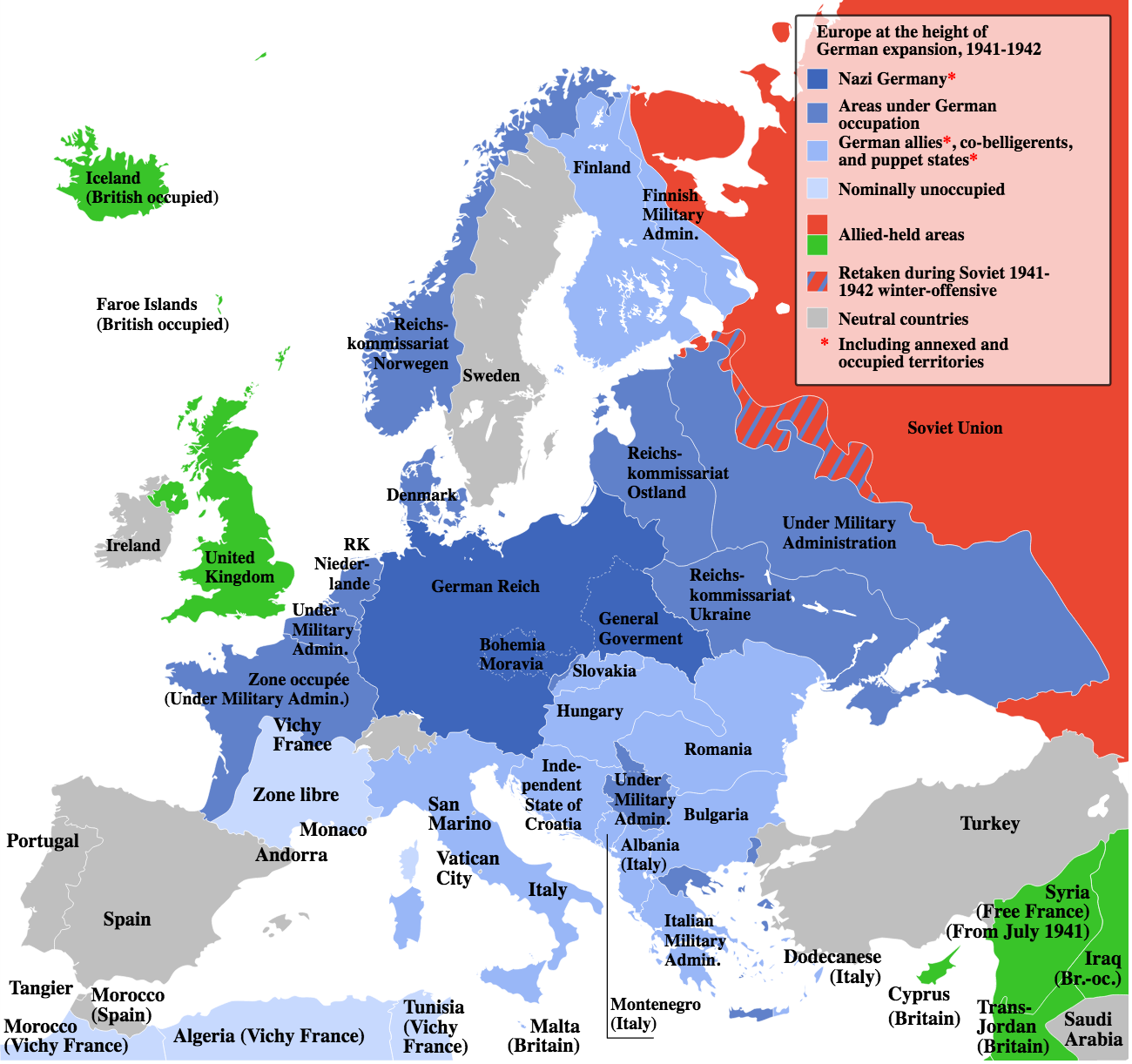
Nazi Germany
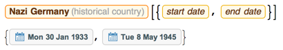
We need finer dates for Nazi Germany because it existed just a few years, let’s choose month:

Get all borders:
    gerPOLY=ParallelTable[EntityValue[Entity["HistoricalCountry","NaziGermany"],
    EntityProperty["HistoricalCountry","Polygon",{"Date"->DateObject[t]}]],{t,gerdates}];

    gerPOLY//Length

gerPOLYcomp=DeleteMissing[DeleteDuplicates[Transpose[{gerdates,gerPOLY}],Last[#1]==Last[#2]&],1,2];
    gerPOLYcomp//Length
9 unique borders out 148 total! Lets plot them all:
    GeoGraphics[{EdgeForm[Red], GeoStyling[Opacity[.07]],
      gerPOLYcomp[[All, 2]]}, GeoProjection -> "Equirectangular",
     ImageSize -> 800, GeoBackground -> GeoStyling["StreetMap"],
     GeoZoomLevel -> 5]
Now, for the history buffs of WWII, I am curious what these borders exactly correspond to in this labeled map from Wikipedia, which differentiates between occupied and allied counties.
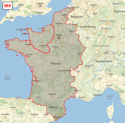
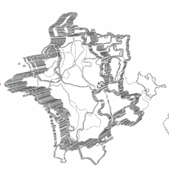
Kingdom of France
Using the same technique we can get the evolution of borders for the Kingdom of France (without remote colonies):
You could probably even 3D print this evolution, a start is here (see attached notebook for code):


 – The Public Domain Review")
 – The Public Domain Review")


 – The Public Domain Review")


Leave a Reply